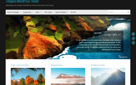

To get Tempera precisely right, we had to stick to a very specific recipe. We start with a very solid framework with over 200 settings, add a very light user interface, threw in a couple of mobiles and tablets to give it that responsive elasticity, added over 50 fonts, aren’t satisfie, so we poured all of Google fonts into the mix, then scattered 12 widget areas for consistency, dissolve a slider and unlimited columns into a customizable Presentation Page, and mixed it in as well. We then peppered all post formats, 8 layouts (including magazine and blog), 40+ social icons, and even an adjustable top bar for extra density.

